How to Read Stock Charts Without Overcomplicating Them
A simple guide to reading stock charts through time frames, price action, trend, volume, and context.
A simple guide to reading stock charts through time frames, price action, trend, volume, and context.
A stock chart shows how price has changed over time. That sounds simple, but beginners often make it harder than it needs to be. They add indicators before they understand price, zoom in until every candle feels important, and treat normal movement as a signal. A better starting point is to read the chart in layers: time, price, trend, volume, and context.
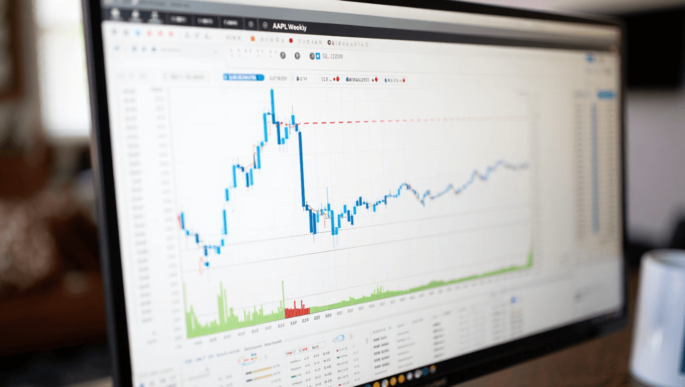
The first choice is the time frame. A daily chart shows one candle per trading day. A weekly chart compresses the picture and can make longer trends easier to see. An intraday chart, such as a 5-minute or 15-minute chart, shows short-term movement but can create noise. Beginners usually learn more from daily and weekly charts because they slow the decision process.
The second layer is price direction. Ask whether the stock is making higher highs and higher lows, lower highs and lower lows, or moving sideways. This does not predict the future. It simply describes what has already happened. Fidelity explains technical analysis as a method focused on market action, especially price and volume. That means chart reading should begin with observation before interpretation.
The third layer is the candle itself. A candlestick often shows the open, high, low, and close for the chosen period. A long candle may show strong movement. A small candle may show indecision or quiet trading. A long wick may show that price moved in one direction but did not hold there. These clues are useful, but a single candle rarely tells enough on its own. Location and context matter.
The fourth layer is volume. Volume shows how many shares traded during a period. A price move with higher volume may suggest stronger participation than a move on low volume. Volume can also help confirm breakouts or warn that a move lacks support. Beginners should at least keep volume visible below the chart from the start.
The fifth layer is support and resistance. Support is an area where buyers have appeared before. Resistance is an area where sellers have appeared before. These are not exact lines. They are zones where traders may react because previous price action created memory. A beginner should avoid drawing too many lines. Two or three major areas are usually more useful than a crowded chart.
Indicators can help, but they should not replace the basic reading. A moving average can smooth price. RSI can show momentum. Volume indicators can help compare activity. Still, every indicator is based on market data that already exists. A clean chart with price, volume, and one or two tools is usually better than a chart filled with signals that conflict.
Chart reading also connects to practice. A paper trading user can take screenshots before and after a simulated trade, then write down what they saw and what actually happened. This connects well with paper trading vs real trading, because it trains process without immediate financial pressure.
The goal is not to predict every move. The goal is to understand what the chart is saying clearly enough to make structured decisions. Good chart reading is patient, simple, and honest. It describes evidence first, then considers possible outcomes.
Sources: Fidelity on technical analysis; Schwab technical analysis education.
Return to the archive and continue with the next practical trading lesson.